Devina Divine

Overview
Devina Divine is a self-initiated beauty brand identity: a full system built from logo to packaging to storefront, designed to show what a luxury press-on nail brand looks like when it is built right from day one.
|
|
|
|---|---|
|
Project type |
Passion project, brand identity + packaging + web |
|
Industry |
Beauty, nail artistry |
|
Designer |
Ahja Lonyae, prettyMARS1991x |
|
Year |
2026 |
|
Deliverables |
Logo suite, brand board, nail display cards, magnetic gift box, sticker set, homepage design |
Visit the project gallery: ahjalonyae.com/project/devina-divine
The Vision
Devina Divine was created to treat nail art as what it is: wearable luxury. The name pairs a personal, feminine first name with the word divine, signaling a brand that feels both intimate and elevated.
I built it as a passion project because so many talented nail techs and press-on makers run real businesses on mismatched fonts, a phone-made logo and plain mailers. Their work is beautiful; their brand rarely matches it. Devina Divine is my answer to the question: what would it look like if the brand were as polished as the set?
The Challenge
The brief I set myself: build a beauty brand that could hold its own next to established luxury labels, across every place a customer touches it.
- Stand out in a crowded feed. Press-on and nail brands compete on Instagram and TikTok, where most look alike. The identity had to be recognizable at thumbnail size.
- Read as luxury without a luxury budget. Small beauty brands print short runs. Every piece had to feel premium using real-world, affordable print formats.
- Work from screen to shelf. One system had to stretch from a homepage hero to a 2-inch sticker without losing its character.
- Make the unboxing the marketing. For a product shipped by mail, the package is the storefront. It needed to be worth filming.
The Approach
I started with the customer, not the logo. The Devina Divine woman treats her nails as self-expression and self-care, and she expects the experience to feel like a gift to herself.
- Positioning. Define the brand as accessible luxury: salon-quality artistry, delivered with boutique presentation.
- Mark first, system second. Design a primary logo, then build secondary marks and a monogram so the brand can scale down to stickers and favicons.
- Brand board. Lock in color, type and graphic elements on one board so every later piece pulls from the same source.
- Touchpoints in order of the customer journey. Homepage (discovery), nail cards and gift box (product and unboxing), stickers (the finishing touch and the share).
The Identity
The identity is built as a family of marks and a tight palette, so the brand looks intentional at every size.
- Logo suite. A primary wordmark, a secondary lockup and a compact monogram for small spaces like stickers, social avatars and the box lid.
- Color. [Primary color] carries the luxury, [secondary color] adds softness, and [accent color] gives it shine. [Add HEX codes.]
- Typography. [Display font] for the wordmark and headlines, paired with [body font] for clean, readable product details.
- Graphic language. [Describe patterns, textures, icons or flourishes used across the system.]
The brand board brings all of it onto one page, the reference that keeps every future piece on-brand.
Applications
Each piece follows the customer from first click to first wear.
|
Touchpoint |
What it does for the brand |
|---|---|
|
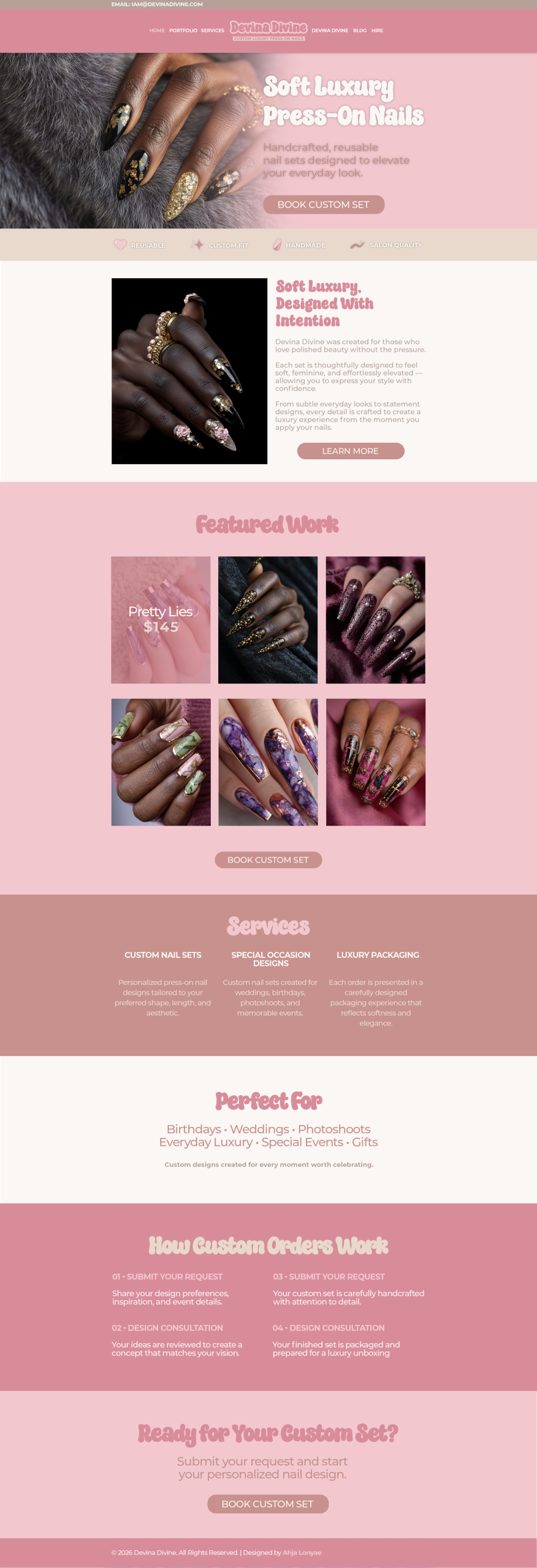
Homepage |
The digital storefront: introduces the brand, showcases sets and moves visitors to shop. |
|
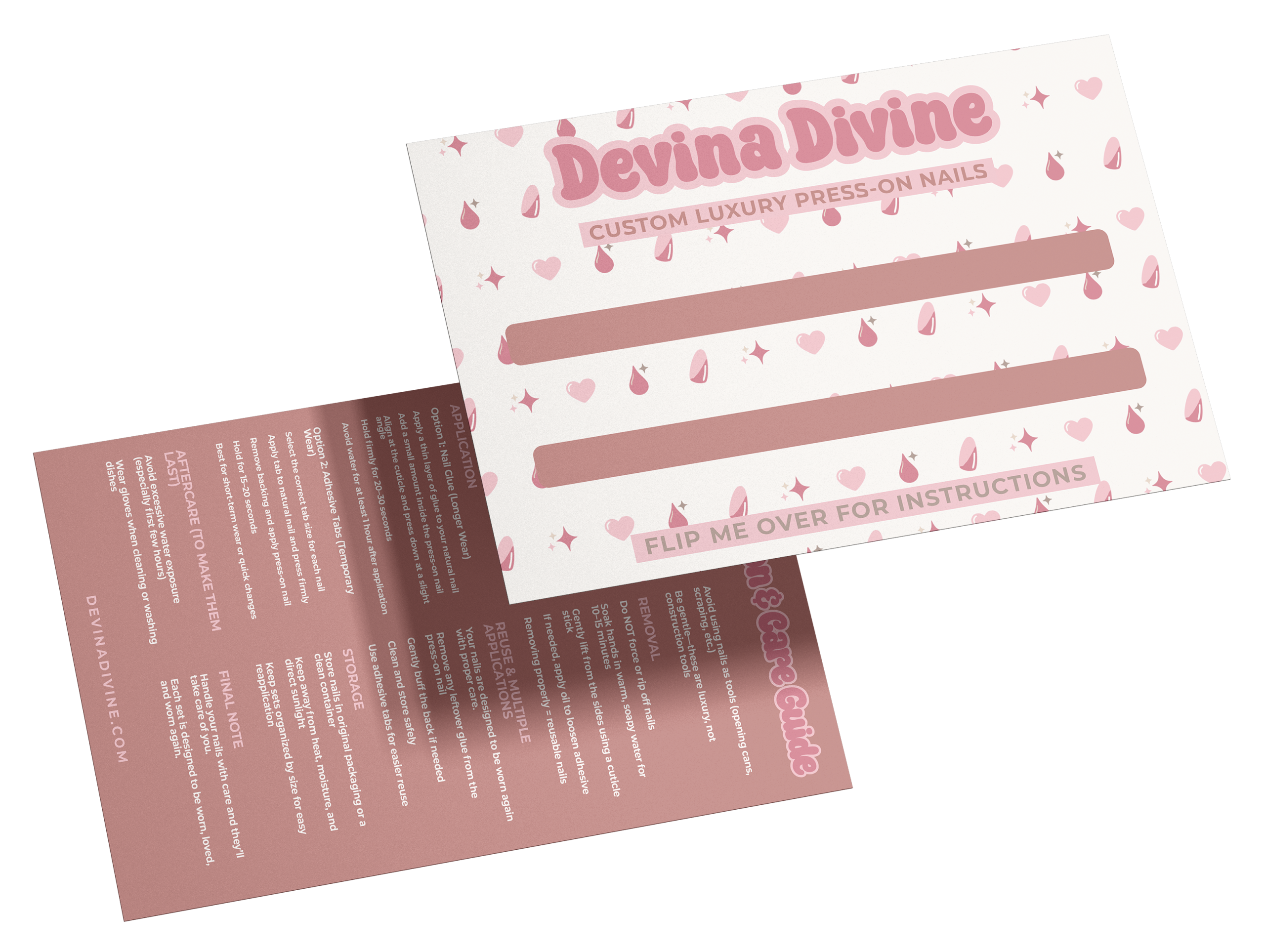
Nail display cards |
Present each press-on set like jewelry, with branding that turns the product into a keepsake. |
|
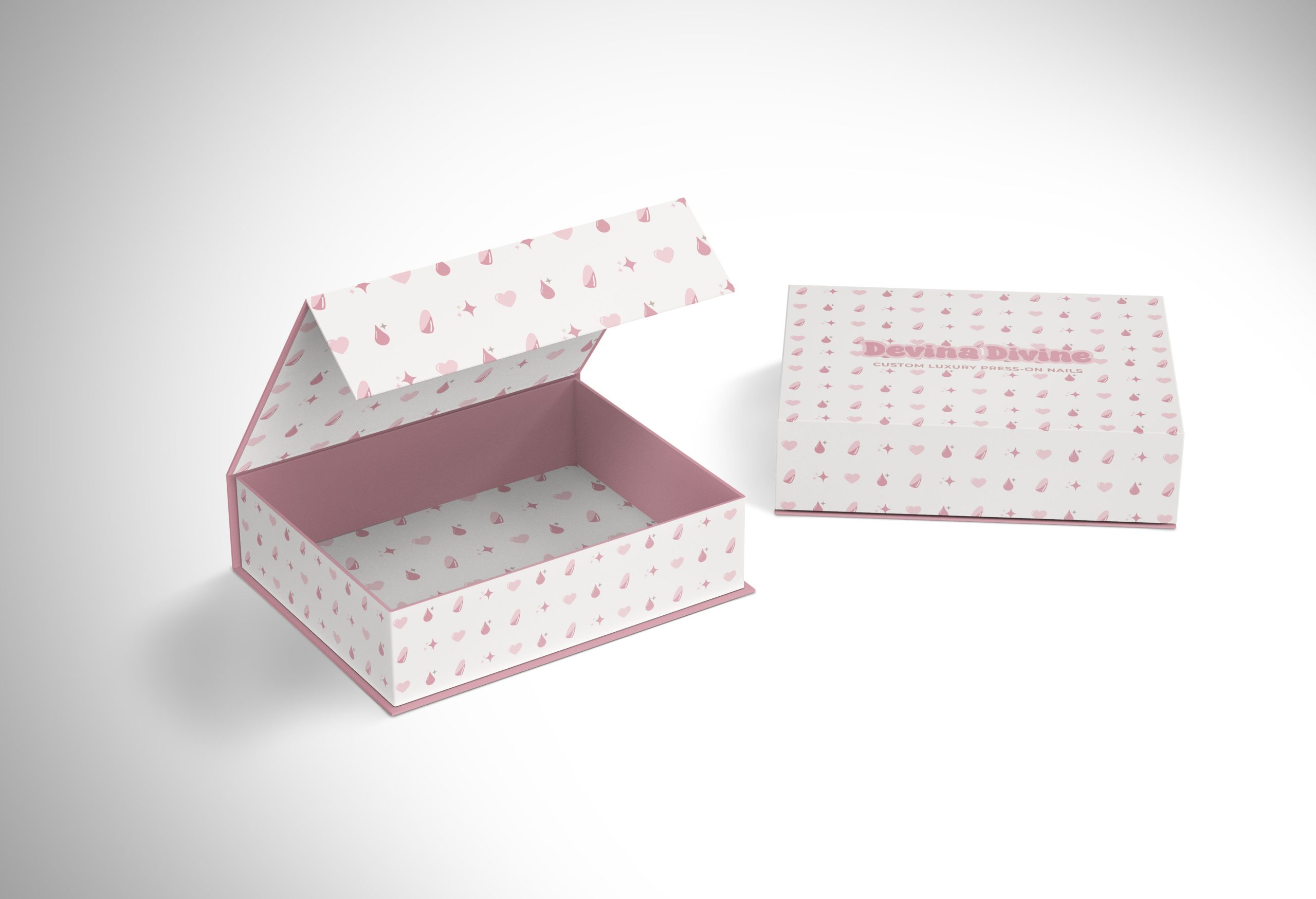
Magnetic gift box |
A rigid, magnetic-close box that makes every order feel like a luxury gift and an unboxing worth posting. |
|
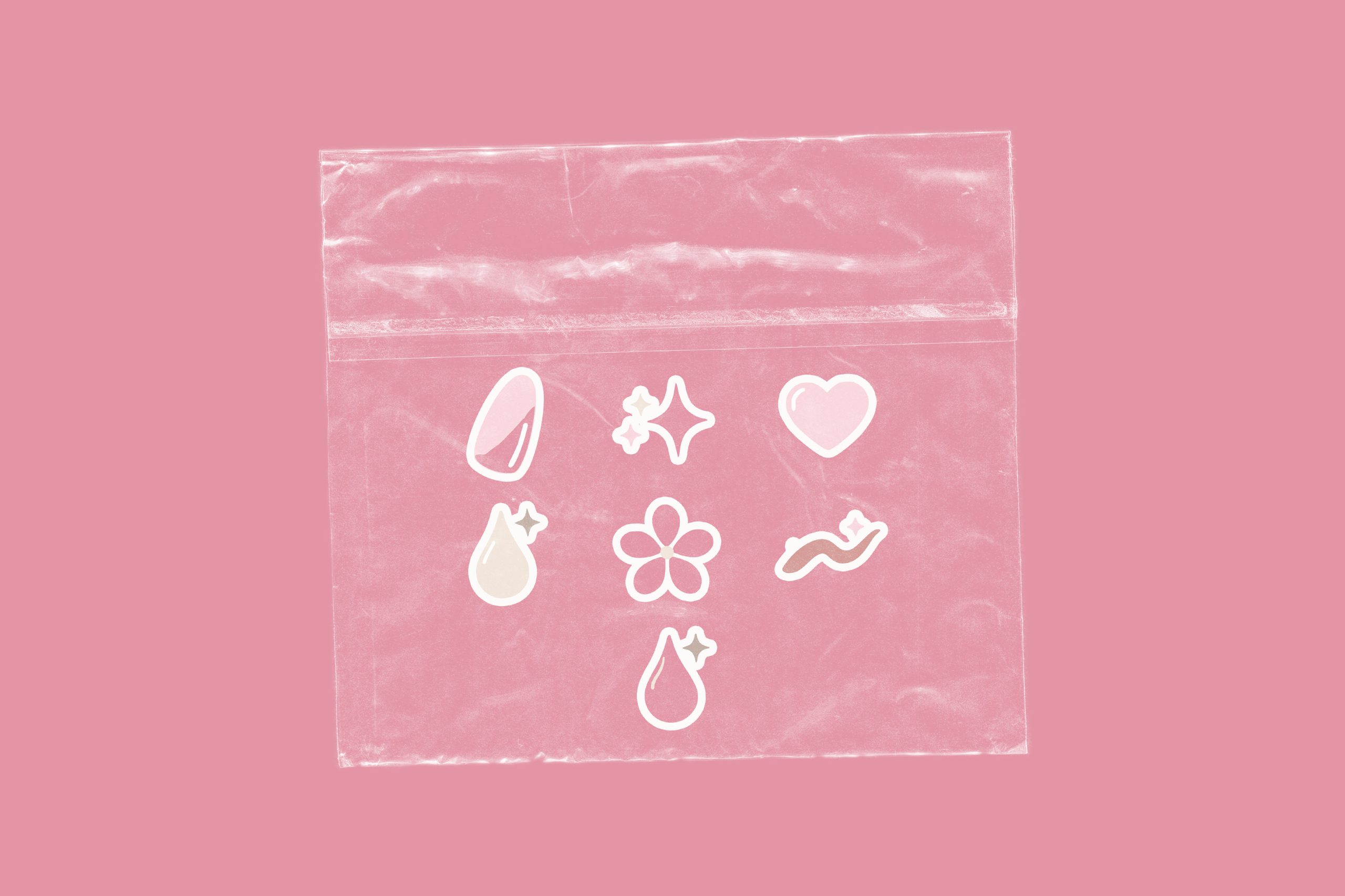
Sticker set |
Seals packages, decorates mailers and travels with the customer, spreading the brand for pennies each. |
Together they prove the system works on screen, on paper and in hand.
Outcome & Reflection
Devina Divine is a launch-ready brand: six deliverables, one consistent system, ready to hand to a printer and a web developer tomorrow.
What this project shows:
- A beauty brand can look established on day one, before the first sale.
- Packaging is marketing. The box and stickers are built to be filmed, shared and remembered.
- A complete system beats a single logo. Consistency is what makes a small brand look big.
As a passion project, it gave me room to design for the beauty industry with no limits, and it is the same level of work I bring to client brands.
Are you a nail tech, lash artist or beauty brand ready to look as good as your work? Let’s build your brand.